Optic Energi
Project Background
Optic Energi delivers innovative telecommunications
networking and infrastructure solutions to a range
of carriers, data-centres, commercial business and
industries that demand safer, intelligent, economical
and more environmentally conscious results.
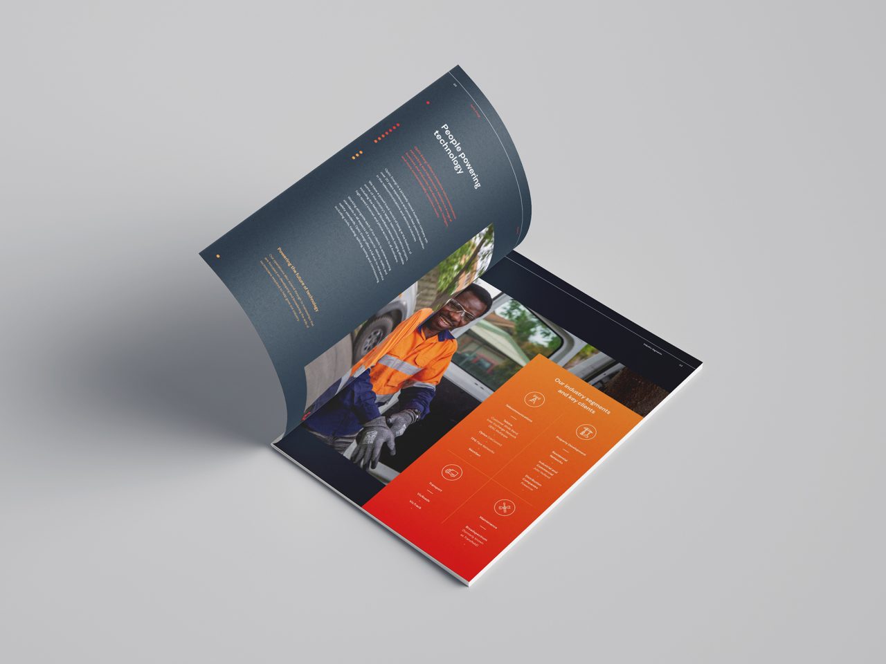
People powering technology
Optic Energi is a privately owned Australian company with over 20 years experience and proven best practice reputation in the telecommunications industry.
Working with the team at Plan B Marketing, we were briefed to develop a new brand identity and positioning that would match their position as an industry leader, and reinforce the family-business values that have driven their success.
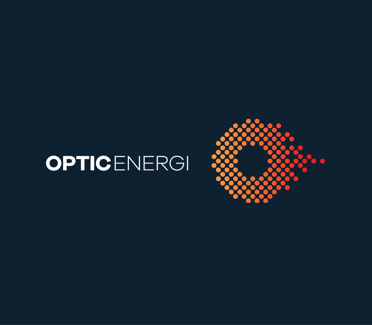
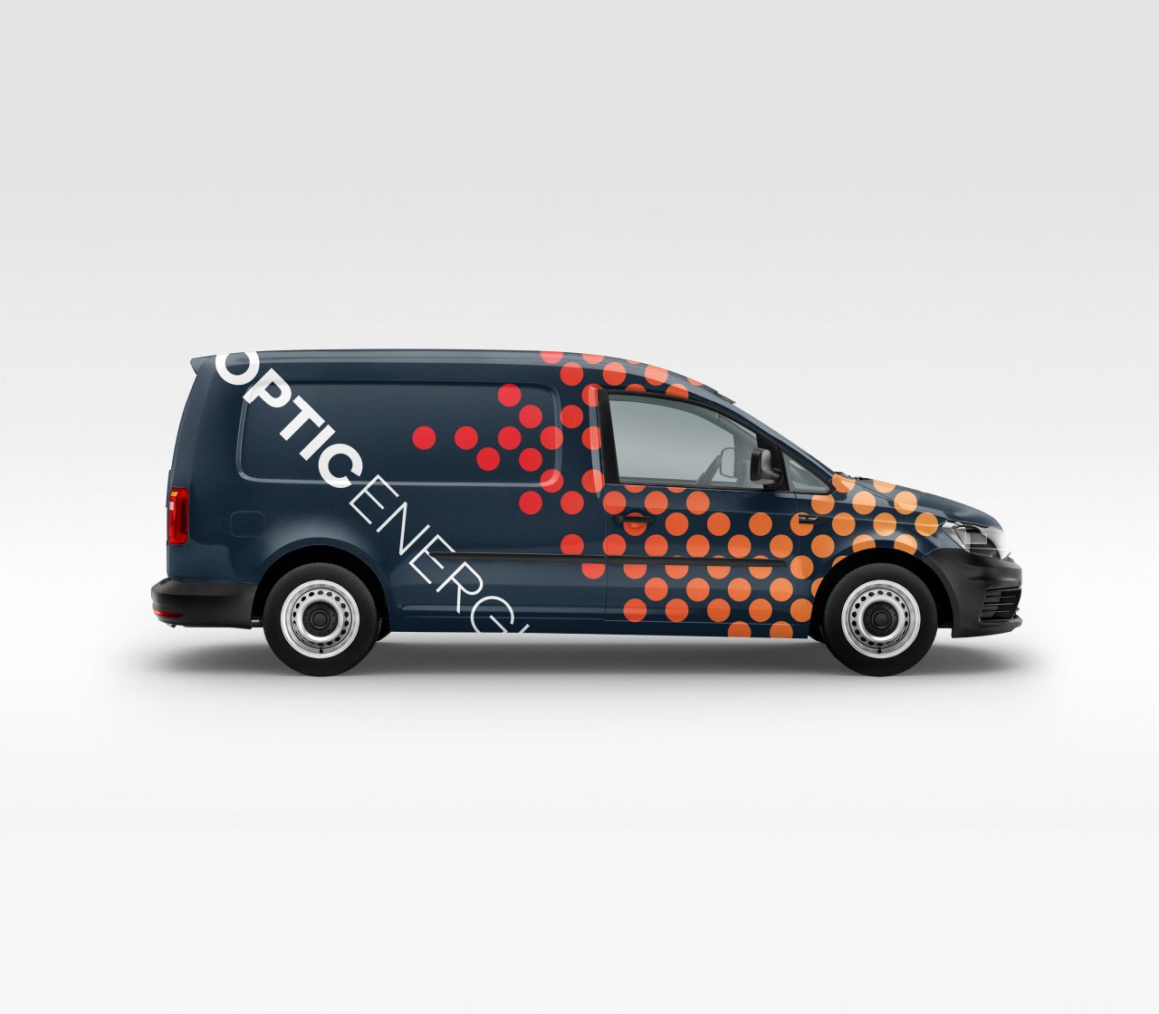
Rather than write off the company’s in-market equity we looked to their existing brand for cues, proceeding with an evolution rather than a reinvention of the logo in the form of a tesselated ‘O’, introducing a sense of dynamism and movement, yet still clearly identifying a network-technology based enterprise.
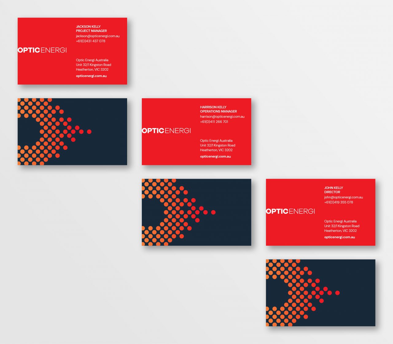
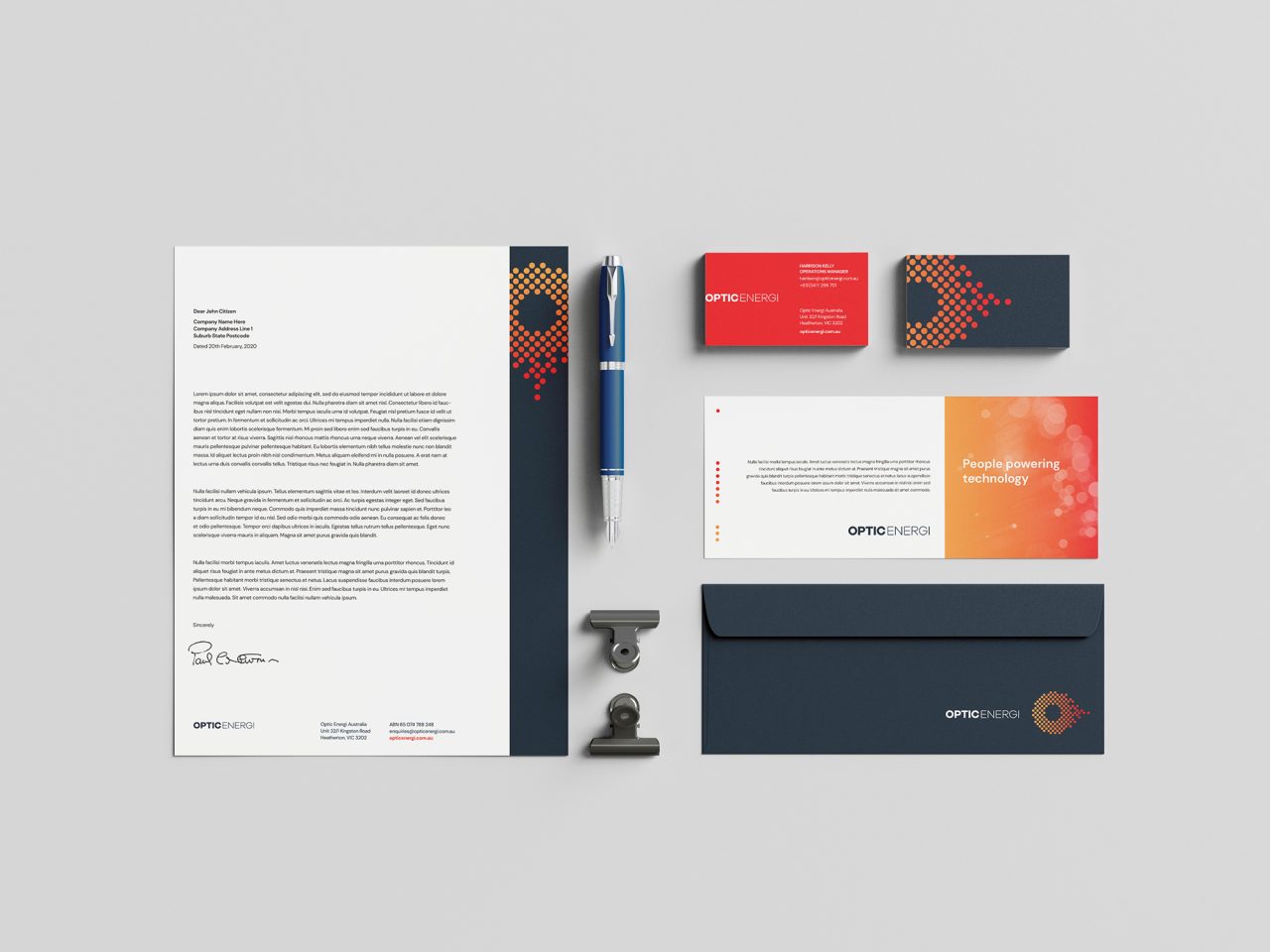
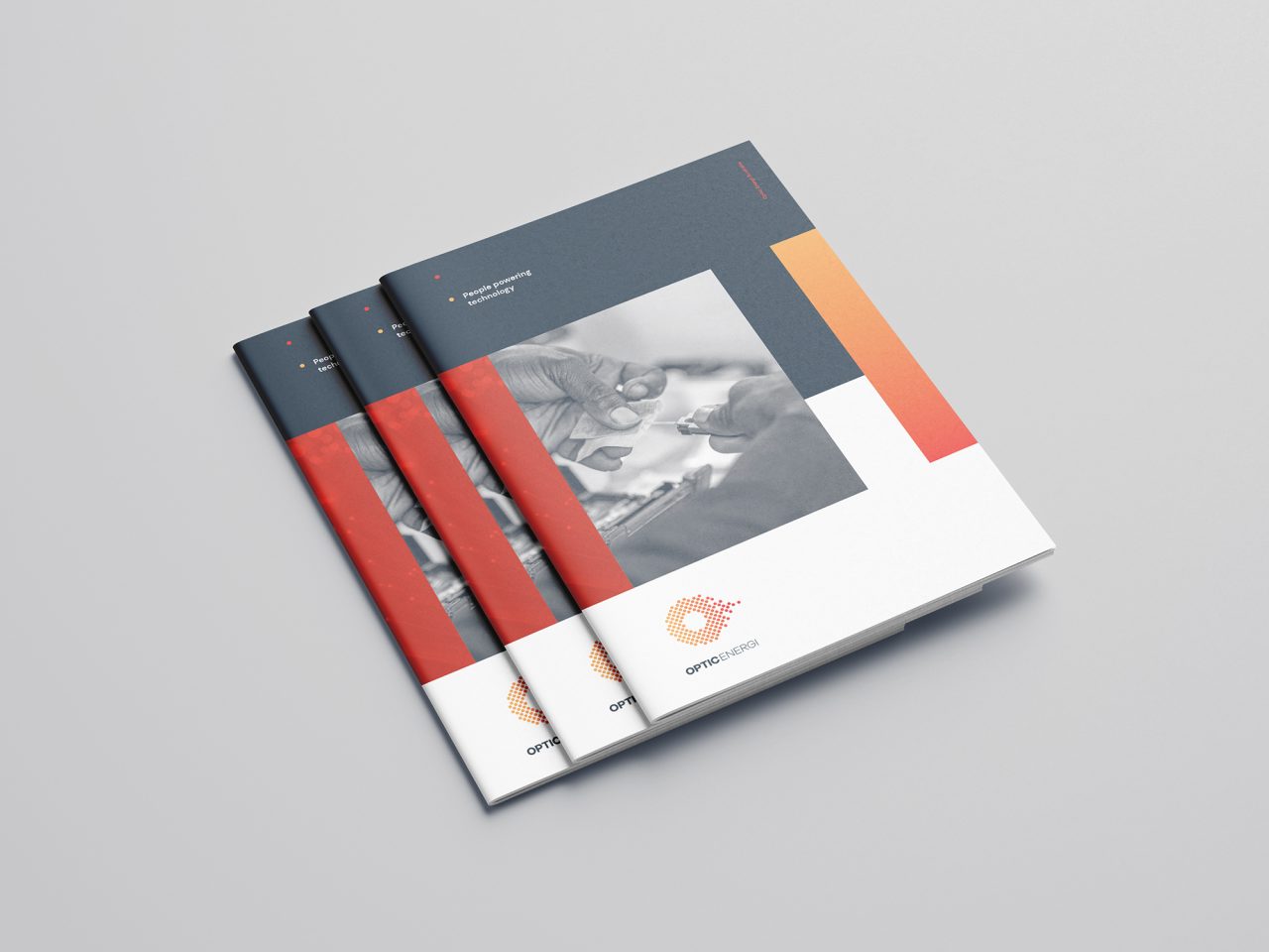
A first stage soft launch has seen the new logo and graphic language applied to a corporate stationery suite including business cards, letterheads and custom corporate folders, accentuated with by a suite of custom photographs of technicians working on site.
Produced for Optic Energi Australia on behalf of Plan B Marketing.

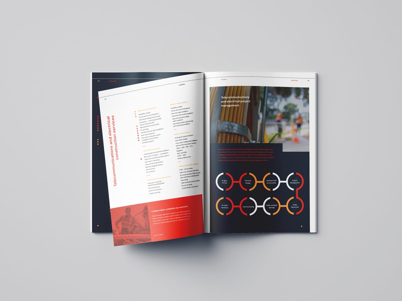
Collaboration underpins our success
Optic Energi’s approach is based on an understanding that today’s industry leaders demand safer, more intelligent and resourceful outcomes to their challenges, and that strong customer relationships are built on confidence and trust.
